|
Software systems and computational methods
Reference:
Laptev M.V., Yanchus V.E., Laptev V.V.
Eye-tracking detection of the area of interest in data visualization
// Software systems and computational methods.
2023. ą 2.
P. 49-62.
DOI: 10.7256/2454-0714.2023.2.43502 EDN: TFRYGR URL: https://en.nbpublish.com/library_read_article.php?id=43502
Eye-tracking detection of the area of interest in data visualization
Laptev Maksim Vladimirovich
Design Engineer, PSK FRAM
196128, Russia, Saint Petersburg region, Saint Petersburg, Varshavskaya str., 5a, office 4-N/38

|
lapt.maxim@gmail.com
|
|
 |
Yanchus Victor Edmundasovich
PhD in Technical Science
Associate Professor, Higher School of Design and Architecture, Peter the Great St. Petersburg Polytechnic University
195251, Russia, Saint Petersburg, Politechnicheskaya str., 29
|
|
victorimop@mail.ru
|
|
|
|
Laptev Vladimir Vladimirovich
ORCID: 0000-0002-7840-377X
Doctor of Art History
Professor of the Higher School of Design and Architecture of Peter the Great St. Petersburg Polytechnic University
195251, Russia, Saint Petersburg, Saint Petersburg, Politechnicheskaya str., 29
|
|
laptevsee@gmail.com
|
|
 |
|
DOI: 10.7256/2454-0714.2023.2.43502
EDN: TFRYGR
Received:
04-07-2023
Published:
04-08-2023
Abstract:
This study examines the features of forming in data visualization. To do this, the authors hypothesize that there are special areas of interest on the charts. The user pays attention to them in order to decode data encrypted with graphics. The presence of such areas, and in some cases, points, are intuitively determined during the formation of the design rules of information graphics. To verify them, the study used the eye-tracking method and the cluster analysis method. The application of interdisciplinary principles and rules of infographics design has been studied on the example of horizontal and vertical bar charts, pie, pictorial and flow charts. The result of experiments with various types of charts showed the presence of additional areas of interest not previously indicated by data visualization specialists. This makes it possible to clarify the features of graphic forms and the formation of diagrams, allows you to verify the use of design rules formulated by the efforts of domestic and foreign specialists in the late XIX — early XX centuries. Such verification can be done using a methodology that includes statistical methods and the tracking method, which allows us to take into account the valuable experience of the past in modern information design. The presented procedure can be extended to other types of charts, diagrams and thematic maps, and have practical application in the analysis of big data visualization.
Keywords:
data visualization, information graphics, eye-tracking method, area of interest, flow chart, pictorial chart, bar chart, pie chart, doughnut chart, formation
This article is automatically translated.
Introduction Data visualization is a common task that a modern designer solves. He has at his disposal a wide range of graphic forms into which he transforms numbers, their rows and arrays. Converting data into graphics faces a number of problems related to the choice of the visualization form and its correct display. In the vast majority of cases, there is variability in shaping due to the wide range of diagrams available. The final choice of the form of such visualization has a pronounced creative character and refers to design as a design and artistic activity. At the same time, the form should fit into the chosen stylistic concept, reveal the architecture of infographics as a meaningful image and therefore should support its functionality. Despite this, the choice of the visualization form and its transformation still cause difficulties for the designer, which sometimes leads to unsatisfactory results. For this reason, this study is relevant. The purpose of this study is to identify the peculiarities of perception of various forms of data visualization with the definition of special areas of user interest. To achieve it, it is necessary to solve a number of tasks: to consider the role of shape and shaping in data visualization; to study the possibilities of the oculography method (eye tracking) to identify special clusters - zones of user interest; to identify the possible influence of such zones on the design rules for the formation of diagrams of various types. The objects of research — graphs and diagrams — relate to infographics as a direction of communicative design. The subject of the study — a feature of shaping in data visualization — is considered and studied from the perspective of information technologies applied to computer graphics, which visually represents numerical data. Therefore, this work is of a complex interdisciplinary nature. 1. Form and shaping in data visualization The idea expressed by means of a diagram (or map, or diagram) is one of the priority principles of building information graphics. To visualize data in a coordinate system, the same numerical sequence can be graphically expressed in several ways. To do this, there are linear, bar, sector, planar or curly diagrams. If there is a geographical distribution of data, then together with the listed methods, a cartogram and a cartodiagram should be included among the pictorial means. "It is important to define precise, commensurate criteria that can be used for classification, choose the best one for this case and explain why readers prefer a different form of graph" [1, p. 139]. Therefore, the main problem facing the information designer at the beginning of the project is the correct choice of the visualization form that best corresponds to the idea of the graph. Taking into account the functionality, the compositional environment of the graph and the semantic significance of the image is also included in a number of tasks solved by it. The variability of the chart type selection can be represented by the example of data structure visualization. As a solution, both bar, and sector, and curly, and flowcharts, and tree maps (tree maps) can be used. In all cases, the user compares the whole (100%) and its fractions, as well as these fractions among themselves. The semantic load can determine the priorities of choice. In the case of dynamic content, it is appropriate to use flowcharts that visually implement the principle of "movement" of data. For static (inherently) data, depending on their quantity and proportional ratios, sector, ring or bar charts are selected. With the predominance of dichotomous construction, the data structure is visualized using tree maps. And if there is a possibility of discrete representation of fractions, then a choice can be made in the direction of curly quantitative diagrams. Each type of data structure visualization has its own limitations and design rules formed during the formation of information graphics. To analyze the result obtained, it is necessary to use qualitative and quantitative assessment methods, taking into account the specifics of infographics. Qualitative methods are traditional for the study of design objects. This is an expert study and identification by means of a survey of the visibility, functionality, aesthetic appeal of a poster or advertising message, diagram or thematic map. Issues related to the design of infographics are closely intertwined with the analysis of finished projects for their effectiveness and relevance. The effectiveness of infographics, following Bertin, is determined by the time spent on visual perception and understanding of the graph: "If in order to get a correct and complete answer to the question, all other things being equal, one graph requires a shorter observation time than the other, then we can say that for this case it is more effective" [1, p. 139]. Consequently, statistical methods can be included in relation to information graphics to assess its effectiveness: indicators such as the speed of solving the problem and the accuracy of the analysis of the data presented are subject to quantitative assessment. In the immediate vicinity of quantifying the effectiveness of data visualization is the problem of ergonomics of the shape of diagrams. The simplicity of perception, taking into account the context and semantic connections between a numeric array and its graphical image affect the readability of infographics. As a result of previous studies [2, 3], the results were obtained that the elements of the visual structure can to a certain extent predictably influence the semantic interpretation of data, which goes beyond the simple reading of data. Therefore, the use of each of the available types of diagrams is associated with certain limitations related to the peculiarities of visual perception and semiotic specifics. However, methods based only on an analysis of the accuracy and speed of data perception or a qualitative (but approximate) assessment do not consider the data set as a whole as a pattern consisting of individual elements of communicative design. To find out how the user evaluates the overall composition of data visualization or its individual forms, the oculomotor activity of a person should be taken into account: the direction of the gaze, the number of saccades and the duration of its fixation. 2. Studying the issues of shaping in infographics using the AI-tracking method
It is known that eye tracking methods have been used to understand the interaction of graph parts [4]; to identify differences in the reading of linear and bar diagrams [5], sector diagrams and tree maps [6]; to assess the influence of layout on the understanding of diagram design [7]. The use of the ai-tracking method made it possible to introduce recommendations on limiting the field and number of linear diagrams in information consoles-dashboards for process control [8]. The study of transport schemes as an object of oculomotor activity analysis made it possible to evaluate additional visualization techniques for detecting patterns or trends [9]. Here it can be noted that certain phases of oculomotor activity are subject to study: drifts, fixations, variants of saccades, nystagmus. Of interest are, firstly, visual fixations (smooth movement of the eye in a small area), and secondly, saccades (abrupt movements of high speed, at which the position of the eye changes dramatically). It is believed that visual information is processed precisely at the moment of fixation [10]. Oculomotor activity is commonly referred to as the way a person views a graphic image, reads and solves visual problems. Eye movements show how shapes are viewed and interpreted. The viewer's intentions determined by the current task also affect eye movements and fixations. This means that oculomotor activity is determined by the current task or a common goal [11]. Thus, the fixation duration and saccade amplitudes can be used as indicators of shape interpretation during search tasks [12]. The overall composition of the image is perceived through the consideration of individual spatial areas, shapes, nodes and shapes. A complex object is visually divided into simpler parts, according to the compositional structure and spatial relations between the parts [13, 14]. There is an analysis of viewing patterns for detecting significant points (Point of Interest, POI), restricted areas or areas (Area of Interest, AOI) or parts of the image (Region of Interest, ROI) that are of interest to the viewer. This allows you to identify critical forms (or parts of them) for data interpretation. Visualization based on the identification of points of fixation of the gaze (point-based visualizations) serves to directly show details of oculomotor activity. Methods based on the analysis of user interest zones (AOI-based methods) refer to the semantic information of the stimulus [15]. The combination of two methods of analyzing eye movement, presented in studies [16], reduces the subjectivity of determining zones of interest (AOI) by using points of interest (POI) while maintaining the possibility of interpretation. Thus, eye movements can be used to analyze data visualization, assess the impact of the type of diagrams and their shape on the effectiveness of solving the problem (correctness and speed) and on user behavior when solving the problem. In earlier studies of the formation of infographics [2, 17, 18, 19], the following indicators of data visualization perception were considered: (1) the total time for solving problems; (2) the average duration of fixation; (3) the average number of fixations; (4) the number of correct answers when solving problems; (5) viewing patterns. With their help, the tasks of verifying the application of interdisciplinary principles and rules for designing infographics, previously defined by domestic and foreign specialists, were solved. The results obtained using the ai-tracking method confirmed the functionality of the shape of the figure diagrams when changing the figurativeness of the sign in the figure diagrams [2]. Here it was determined that there was no influence of the figurativeness of symbols on the duration and performance when solving problems on the perception of figure diagrams, as well as on perception patterns (eye movement models). However, it was additionally revealed that the composition of figure diagrams (design visualization) has a significant impact on perception patterns. At the same time, stable zones of interest of the respondent are formed. Other studies [17, 18] have confirmed the rules for constructing flowcharts. These rules were formulated back in the XIX century [20] in terms of maintaining a stable thickness of a continuous stream, uniform formation of the roots of streams, spatial arrangement of nodes, the integrity of the composition when the stream interacts with external landmarks. Here, the AI tracking method was used in conjunction with cluster analysis, which made it possible to detect areas of interest when considering flowcharts. Based on the results obtained, it became possible to design a flowchart of user paths, which is an applied web analytics tool, an alternative to the existing Google Analytics system. Conclusions were drawn about the significant influence of the type of diagram on the average number of correct answers as a result of the analyzed data on the impact of various factors (including subjective overall load) on the effectiveness of solving the problem and on behavior in solving it. It should be noted that according to parameters such as the speed of solving problems and the number of correct answers, the developed version is also more effective than the original Google Analytics chart. The data obtained can be used to improve the quality of work of web analytics specialists, as well as in areas such as the development of web application interfaces and usability research. The study of various types of bar and sector diagrams [19] is devoted to comparing the effectiveness of perception of various types of data structure visualization diagrams, studying the peculiarities of the formation of the viewing pattern using the ai-tracking method. As a result, it turned out that bar and ring diagrams are easier to evaluate with a quick review, whereas the use of sector diagrams leads to their more detailed study. To visualize a single static data structure, it is worth giving preference to the bar type of diagrams. Sector diagrams should be selected only if there is an appeal to associative forms. All these theses were confirmed not only by analyzing the effectiveness of perception of structural data visualization, but also by using the cluster analysis method to form areas of interest. The results of these studies indicate the need to detect zones (or points) of interest and interpret their meaning for data visualization. This helps to determine the effectiveness of the choice of the form of the visual image. The method of such detection is based on a cluster analysis of human oculomotor activity using an oculography (eye-tracking) system. This makes it possible to include in the initial parameters not only the accuracy and speed of determining the parameters, but also to register the direction of the observer's gaze, the duration of its fixation, to determine the zones of interest for subsequent interpretation. 3. Determination of the user's AOI based on cluster analysis
The analysis of oculomotor activity is a complex and non-trivial task, during the solution of which it is necessary to take into account several factors at the same time. These are the coordinate position of the gaze point and their grouping, the length of the saccade, the sequence of gaze movement, the duration and amount of fixation, and other parameters. Such types of tasks as time or coordinate grouping in the analysis of AI tracking data can be solved using cluster analysis [17, 21, 22]. At the same time, the main difficulty of grouping objects into previously unknown groups is the lack of a pre-known number of clusters and their characteristics. In the AI-tracking study of flowcharts [17], the problem of determining the number of clusters was solved by means of hierarchical divisive algorithms. They worked with a universal cluster consisting of all visual fixations, followed by a step-by-step division of it into smaller parts according to the assigned features. The k-means method with a multidimensional vector based on coordinate construction was chosen as the clustering device. Visualization of the result with 4-cluster partitioning is shown in Figure 1 with a demonstration of the stimulus material of one of the tasks and the points of fixation of the subjects' gaze. Taking into account the semantic characteristics of the incentive diagram makes it possible to clarify the presence of points of interest as centers of formation of user interest zones. 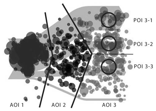
Fig. 1. Visualization of the cluster model correlated with eye fixations. The zones of user interest (AOI) obtained on the basis of cluster analysis taking into account the semantics of the stimulus are highlighted Fig. 1. Visualization of a cluster model correlated with eye fixations. The areas of user interest (AOI) obtained on the basis of cluster analysis considering the semantics of the stimulus are highlighted Clustering algorithms [15, 17] and semantic grouping of points of interest make it possible to identify three main areas of interest based on the coordinates of the gaze and the duration of fixation. One group of fixations is concentrated in the incoming part of the stimulus (flowchart) on the left side. Two outgoing groups are located in its right part. They are combined into a single area of interest for a semantic reason. A stable cluster located in the central part of the stimulus is detected. Each part of the structure is compared with the presented data variants sequentially from the upper right part and further down. This is due to the user's right zone of interest (AOI 3). Each part is also compared with the whole represented by the "input" cluster (AOI 1). The central zone of interest (AOI 2) interprets the comparison of parts among themselves in the dynamic part, when there is already a division into parts, but it is still insignificant. In this case, the streams are compositionally combined into a single block. Obviously, a narrative can be traced when considering a flowchart, revealing the sequence of flow movement, from the whole to its structural parts. As a result of the analysis of the visual evaluation of the cluster model, it can be concluded that the clusters are arranged in accordance with the structure of the stimulus in the form of a 4-flow diagram. That is, oculomotor activity is determined by the current task or a common goal [11]. The output cluster has clearly expressed three points of interest (POI 3-1, 3-2, 3-3), and there is no such point of interest on the smaller (fourth) flow of the diagram. This is due to the task and the proposed sets of answers: the user has no difficulty in answering the question about the data visually represented by this obviously smallest stream. Interpretation of these results allowed us to give a recommendation on the form of the flowchart. Firstly, there is an indifference of visual perception to the separation of the input stream into its component parts in the root initial area of interest (AOI 1). This allows you to painlessly use the color selection of individual streams in static flowcharts or in interactive versions of flowcharts. Secondly, the deformation of the shape of the flow in the middle part is crucial for visual perception, since there is a change in behavioral reactions associated with the loss of semantic links between the process and the visualization method. For example, a preliminary analysis of flowcharts of user paths in Google Analytics (Fig. 2) showed that one of the disadvantages of visualization is the unstable thickness of the shape of the streams [18]. 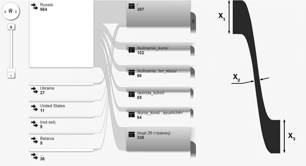
Fig. 2. Flow chart of Google Analytics user paths (the fragment shows a change in the thickness of the stream in the middle part several times) Fig. 2. Flow chart of Google Analytics user paths (the fragment shows a change in the thickness of the flow in the middle part several times) The following example of analyzing the form of data visualization is demonstrated in the study [19], the purpose of which is to compare the effectiveness of perception of various types of data structure diagrams. Additionally, the features of the formation of the viewing pattern using the ai-tracking method are studied. The experiment considered 4-particular data structures with a dominant share (65-75%) and three relatively small shares. Vertical and horizontal bar charts, sector and ring charts are used as a tool for visualizing the data structure. Interesting results are obtained for sector and ring diagrams. Using cluster analysis of the viewing pattern, we obtained the points of interest of the user POI 1-3 in the area of arcs of small sectors (Fig. 3). This is true for both sector and ring diagrams. In addition, there is a point of interest POI 4 in the center of the circle, the center of which coincides with the center of the diagram. As a result, you can see the AOI area of interest in the form of an elongated ellipse for a sector diagram and its concentric shape for a ring diagram. 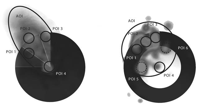
Fig. 3. Formation of points and zones of user interest (POI, AOI) obtained on the basis of cluster analysis taking into account the semantics of the stimulus for the sector diagram and for the ring diagram
Fig. 3. Formation of the user's points and area of interest (POI, AOI), obtained on the basis of cluster analysis, considering the semantics of the stimulus for the pie chart and for the doughnut chart If for a sector diagram this indicates a possible comparison of the angular values of the sectors or a reference point, then there is no angular comparison for a ring diagram. This means that the human eye is looking for a reference point in the center of the pie chart for visual comparison of the arcs of sectors. This is confirmed by studies of the perception of various variants of the shape of ring diagrams [23]. By adding a reference point in the center of the diagram, the effectiveness of its visual perception increased. By the way, this can explain the change in the shape of the pattern of viewing the ring diagram relative to the sector diagram. The absence of a central point leads to the appearance of additional points of interest POI 5 and POI 6, which correspond to the boundaries of a large sector. And the ellipsoid zone of interest turns into a concentric zone of interest. Studying the shape of a bar diagram that visualizes the data structure is the next example of using the method of oculography. We can see a different strategy for viewing vertical and horizontal bar diagrams (Fig. 4). So, the pattern of viewing a vertical diagram shows that the user studies only small parts of the structure in its upper part. At the same time, it does not pay attention to the dominant segment of the structure located in the lower part of the bar. On the contrary, looking at the horizontal diagram of the data structure causes the appearance of two zones of interest. The first zone of interest (AOI 1) is formed by studying the dominant lobe by the viewer, and the second arises when considering small lobes. Obviously, in the case of horizontal bar diagrams, there is an explicit comparison of the parts of the structure with each other. And in a vertical bar, the main part of the structure is fixed by fovial vision. 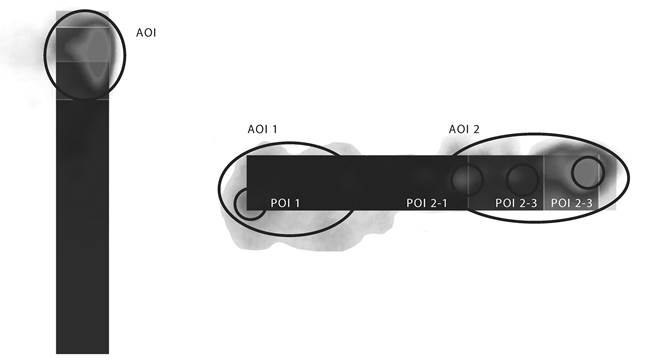
Fig. 4. Formation of points and zones of user interest (POI, AOI) obtained on the basis of cluster analysis taking into account the semantics of the stimulus for vertical and horizontal bar diagrams Fig. 4. Formation of points and areas of interest of the user (POI, AOI), obtained on the basis of cluster analysis, considering the semantics of the stimulus for the vertical and horizontal bar chart Additionally, the analysis confirms the empirical research carried out earlier, according to which even small changes, such as rounding the top of a rectangular bar, leads to an increase in the error rate [24]. This statement can be extrapolated to the significant boundaries of the parts in the bar diagrams themselves. Horizontal borders for a vertical bar chart and vertical borders for a horizontal bar chart should be contrast-visualized and have no distortion. The lower border of the vertical bar becomes an exception. It can be visualized with less care, for example, blurred or deformed. But this assumption, in turn, requires additional comparisons and research. 4. Discussion and conclusions The results of the research presented here are based on the oculography method and the clustering method due to deterministic behavior. As a result, we expect them to become useful tools for studying data visualization forms to detect and analyze areas of interest to the viewer. This is true both for use in experimental analysis and for automating content solutions in interactive systems using AI tracking. This approach is most applicable in situations involving viewing an image or scene, unlimited in time and space, for example, following the example of previously performed studies of the composition of a movie frame [25]. The AI-tracking method can be used to study the ergonomics of visual perception of planar models of three-dimensional objects, for example, surface reliefs in cartography and hydrology, in ultrasound and laser sensing, and in other applied engineering tasks. The issues of color coding in the visualization of arrays of information, the formation of recommendations on the color scheme of diagrams remained outside the scope of this study. Visual perception of individual colors, groups of contrasts and color schemes remains an urgent task. This requires further study, including using the AI-tracking method and the cluster method of analyzing the results obtained, which can be based on the definition of points of interest and areas of interest of the user. We need to say that the cluster analysis was carried out on the basis of one of the possible signs: the coordinate location of oculomotor activity fixations. This article did not consider clustering based on the principles of estimating the proximity or sequence of saccades, the duration of fixations, and so on. The use of various principles of cluster analysis for processing oculomotor activity data requires further separate research. Perhaps interesting are new experimental protocols, clustering algorithms and interactive systems for determining areas of interest. Their location and properties can be used to study the features of visual perception of different groups of viewers, the similarities and differences of the tasks being solved, or the use of different versions of images. This could be done both in coordinate space by comparing cluster centroids created by different users or their groups, and on a timeline. The relative number of data points within a cluster indicates its importance for determining areas of interest. This can make the cluster method useful for quantifying visual interest. Algorithmization of the analysis of cluster models makes it possible to translate the visual interpretation of numerical data structures into the range of decision support tasks solved using software tools.
The application of the cluster method of analyzing the results of AI-tracking research in relation to visualization tools is of direct importance for information design. This makes it possible to clarify the features of graphic forms and the formation of diagrams, allows you to verify the use of design rules formulated by the efforts of domestic and foreign specialists in the late XIX — early XX centuries. Such verification can be done using a methodology that includes statistical methods and the AI tracking method, which allows us to take into account the valuable experience of the past in modern information design.
References
1. Bertin, J. (2011). Semiology of Graphics. Diagrams. Networks. Maps. Redlans: Esri Press.
2. Laptev, V. V., & Orlov, P. A. (2016). The Eye-Tracking Study of Effects of the Stylisation Level in Pictorial Charts. Humanities and Science University Journal, 19, 44–56.
3. Ziemkiewicz, C., & Kosara, R. (2010). Implied Dynamics in Information Visualization. Proceedings Advanced Visual Interfaces (AVI), 215–222.
4. Huang, W. (2007) Using eye tracking to investigate graph layout effects. Proceedings of the 6th Asia-Pacific Symposium on Visualisation, 97–100.
5. Goldberg, J. H., & Helfman, J. I. (2010). Comparing information graphics: a critical look at eye tracking. Proceedings of the 3rd BELIV’10 Workshop: Beyond time and errors: Novel evaluation methods for information visualization, 71–78.
6. Huestegge, L, & Pötzsch, T. H. (2018) Integration processes during frequency graph comprehension: Performance and eye movements while processing tree maps versus pie charts. Applied Cognitive Psychology, 32(2), 1–17. doi:10.1002/acp.3396
7. Sharif, B., & Maletic, J. I. (2009). An empirical study on the comprehension of stereotyped UML class diagram layouts. Proceedings of the IEEE 17th International Conference on Program Comprehension, 268–272.
8. Orlov, P., Ermolova, T., Laptev, V., Mitrofanov, A., & Ivanov, V. (2016). The Eye-tracking Study of the Line Charts in Dashboards Design. Proceedings of the 11th Joint Conference on Computer Vision, Imaging and Computer Graphics Theory and Applications, 2, 205–213.
9. Burch, M., Wallner, G., Broeks, N., Piree, L., & Boonstra, N. (2021). The Power of Linked Eye Movement Data Visualizations. ETRA '21. ACM Symposium on Eye Tracking Research and Applications, 1–11. doi:10.1145/3448017.3457377
10. Velichkovsky, B. M. (2006). Cognitive science: fundamentals of the psychology of cognition. Moscow: Academy.
11. Yarbus, A. L. (1967). Eye Movements and Vision. Plenum Press. doi:10.1007/978-1-4899-5379-7
12. Prats, M., Garner, S., Jowers, I., McKay, A., & Pedreira, N. (2010). Interpretation of geometric shapes – an eye movement study. Proceedings of the 2010 Symposium on Eye-Tracking Research & Applications, 243–250.
13. Biederman, I. (1987). Recognition by components: A theory of human image understanding. Psychological Review, 94(2), 115–147.
14. Hoffman, D. D., & Richards, W. A. (1984). Parts of recognition. Cognition, 18(1–3), 65–96.
15. Rim, N. W., Choe, K. W., Scrivner, C., & Berman, M. G. (2021). Introducing Point-of-Interest as an alternative to Area-of-Interest for fixation duration analysis. PLoS One, 16(5). Retrieved from https://pubmed.ncbi.nlm.nih.gov/33970920/ doi:10.1371/journal.pone.0250170
16. Blascheck, T. et al. (2016). AOI hierarchies for visual exploration of fixation sequences. Proceedings of the Ninth Biennial ACM Symposium on Eye Tracking Research & Applications, 111–118.
17. Laptev, V.V., & Orlov, P.A. (2015). Cluster analysis of visual perception of data structure. Business Informatics, 3(33), 34–43.
18. Laptev, V.V., Orlov, P.A., & Dragunova, O.V. (2017). Visualization of dynamic data structures with flow charts in web analytics. St. Petersburg State Polytechnical University Journal. Computer Science. Telecommunications and Control Systems, 10(4), 7–16. doi:10.18721/JCSTCS.10401
19. Ermolova, T. K., Ivaschenko, P. D., & Laptev, V. V. (2019). Studying the efficiency of visualization of static data structures by means of bar and pie charts by eye-tracking method. St. Petersburg State Polytechnical University Journal. Computer Science. Telecommunications and Control Systems, 12(2), 16–27. doi:10.18721/JCSTCS.12202
20. Yanson, Yu. E. (1891). Theory of statistics. SPb.: Schroeter.
21. Haass, M. J. et al. (2016). A new method for categorizing scanpaths from eye tracking data. Proceedings of the Ninth Biennial ACM Symposium on Eye Tracking Research & Applications, 35–38.
22. Murray, N. et al. (2019). An examination of the oculomotor behavior metrics within a suite of digitized eye tracking tests. IEEE J Transl Eng Health Med, 5(4), 1ؘ–5.
23. Cai, X., Efstathiou, K., Xie, X., & Wu, Y. (2018). A Study of the Effect of Doughnut Chart Parameters on Proportion Estimation Accuracy. Computer Graphics Forum, 37(3), 1–13. doi:10.1111/cgf.13325
24. Skau, D., Harrison, L., & Kosara, R. (2015). An evaluation of the impact of visual embellishments in bar charts. Proceedings of Eurographics Conference on Visualization, 34(3), 221–230.
25. Borevich, E. V. (2023). Eye-tracking study of the influence of composition on the perception of a film frame. Program systems and computational methods, 1, 51–60. doi:10.7256/2454-0714.2023.1.39634 EDN: IWYBNX Retrieved from https://nbpublish.com/library_read_article.php?id=3963
Peer Review
Peer reviewers' evaluations remain confidential and are not disclosed to the public. Only external reviews, authorized for publication by the article's author(s), are made public. Typically, these final reviews are conducted after the manuscript's revision. Adhering to our double-blind review policy, the reviewer's identity is kept confidential.
The list of publisher reviewers can be found here.
The reviewed article is devoted to an urgent task in the field of computer design – focusing the user's attention on certain elements. The authors use the AI tracking method to analyze the user's attention to various forms of data representation, solving the visualization problem comprehensively, taking into account the semantic significance of the data. The authors use qualitative and quantitative methods of analysis, which increases the reliability of the results obtained. The positive side of the work is the formulation of efficiency criteria, consideration of ergonomics, and an emphasis on compositional characteristics. The authors elaborate on the features of user reading of various types of visual representations, taking into account all phases of oculomotor activity, and present the results of a review of research in this direction. The strength of the study is the use of analytical tools that allowed us to identify the correlation between the estimated parameters. The structure of the article meets the requirements for publication, the results of the study carried out by the authors do not contain quantitative estimates. The style of presentation meets the requirements. There are illustrations. The possibilities of using the research results in various fields are presented, the authors note the main directions of using the considered methods. The bibliography contains 25 sources, mainly in foreign indexed sources, as well as domestic peer-reviewed journals. Doi are specified. There are links in the text. Remarks. The authors are offered the opportunity to present the presented illustrations in color, which will improve the reader's perception of its content. It should be noted that some forms of visual representation (graphs, bar and sector diagrams) are more familiar and, therefore, understandable to the user in the case of a small number of variables. Tree maps and flowcharts are typical for narrower areas; understanding them will require more time from the user, which will be recorded by the AI tracker. In the experimental part, it is necessary to add a description of the experiment (the analyzed data, it is possible to provide a screenshot of one of the tasks). What are the described points of interest, questions to the user, suggested answers (it is necessary to specify). It is advisable to add a justification for why the division is carried out specifically into 4 clusters. Captions in 2 languages? It is advisable to provide a layout scheme for the analyzed page or graphic information of the task, which will allow you to specify it. There is a lack of specifics in the description of the experiment. The flowchart in Figure 2 is difficult to read due to its poor quality. It is necessary to increase the font and/or make the text more contrasting relative to the background. The variables X are not explained. Comparisons of chart perception are provided based on previous studies that are not the subject of research in this article. It is advisable to note what was the reference point in the above studies and mention descriptions of stimuli. The results of the analysis of bar charts (with accumulation?) compressed. The article will be of interest to a wide range of specialists and has practical value for all areas where the research result is presented graphically. The article corresponds to the subject of the Journal and can be published without re-reviewing
|


